Picking the right interior paint color is more than just finding a shade you like. It's about knowing how that color will look and feel in your home. The biggest things to think about are the room's natural light, the mood you want, and your current furniture.
This guide will help you choose the perfect interior paint colors for your home in Monterey, Salinas, or anywhere on the coast.
Starting Your Paint Color Journey
Deciding on a new paint color can feel like a big step, but it doesn't have to be scary. The key is to know what you want before you get overwhelmed by paint chips at the store.
Think of it as creating a vision for your room. The color on your walls sets the mood for everything else.
Key Factors to Consider
Before you start looking at samples, take a moment to look at your room. A little planning now can save you time and money later.
Ask yourself these questions:
- What is this room used for? Is it a busy kitchen in Monterey or a quiet bedroom in Pacific Grove? The room's purpose will help you choose the right color family.
- What feeling do you want? Do you want the room to feel cozy and warm, or bright and open? Color can change how you feel in a space.
- What do I already have? Look at your furniture, floors, and art. Your new wall color needs to work well with these items.
A recent study found that over 70% of homeowners said the mood a color creates is a top factor in their choice. This is why warm, neutral colors are popular—they make a space feel welcoming.
Of course, even the best color won't look good on a dirty wall. A great paint job starts with a clean surface. For tips, check out our guide on how to clean walls before painting.
How Light Changes Everything
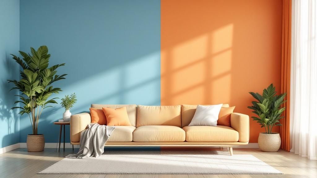
Light is the most important factor when you learn how to choose interior paint colors. A color can look perfect in the store but totally different on your wall. A clean white might look yellow, or a nice gray might look purple.
This happens because paint color changes with the light around it. Understanding the light in your Monterey Bay home is the secret to getting it right.
Natural Light and Its Direction
The direction your windows face changes the quality of natural light. You have to work with it, not against it.
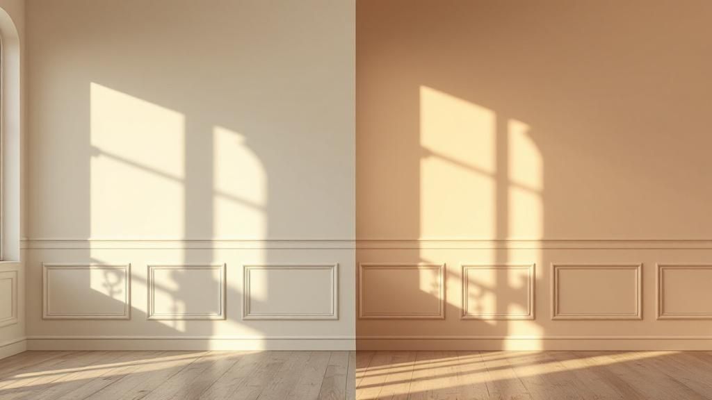
- North-Facing Rooms: These rooms get cool, blueish light. Dark, dramatic colors can look amazing and cozy here. If you choose a light color, make sure it has a warm undertone to balance the cool light.
- South-Facing Rooms: In sunny areas like Carmel, these rooms get bright, warm light all day. This strong light can wash out pale colors, so don't be afraid to pick a bolder shade.
- East-Facing Rooms: These rooms get warm light in the morning and cooler light in the afternoon. A versatile, neutral color often works best.
- West-Facing Rooms: The afternoon light in these rooms is very warm, almost orange. This can make warm paint colors feel too strong, so keep that in mind.
The Role of Artificial Lighting
The type of light bulbs you use will also change how your walls look at night. This is a detail many people forget.
Expert Tip: Test your paint samples at night with your lights on. A color that looks great during the day might look strange under artificial light.
Different bulbs have different color "temperatures." A lower number (around 2700K) gives a warm, yellow glow. A higher number (4000K and up) gives a crisp, bluish light like daylight. This can make the same paint color look completely different.
Once you find the perfect color, our guide on how to paint a room for beginners can help you with the next steps.
Matching Paint Color to Your Room's Vibe
Every room in your home has a purpose. The right paint color can help it serve that purpose by setting the mood. This is about using color psychology to make your home work better for you.
When figuring out how to choose interior paint colors, think about the vibe you want. Do you want your Salinas living room to be a cozy spot for relaxing, or a fun place for parties?
Designing a Mood Room by Room
Let's look at how to match colors with common room functions. This will help you create spaces that feel just right.
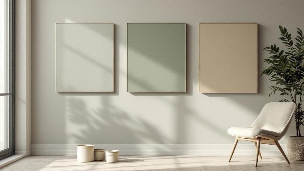
- Living Rooms: For relaxation, use warm neutrals and earthy tones like soft beige or muted green. If your living room is for entertaining, a bolder color like deep blue can add energy.
- Bedrooms: This is your personal space. Soft blues, gentle greens, and muted lavenders are known for being calm and restful.
- Kitchens: Kitchens often feel best with colors that are clean and energizing. Bright whites or cheerful yellows can make the space feel lively.
- Home Offices: To improve focus, blues and greens are great choices. They can help reduce stress during a long workday.
Room Mood and Color Suggestions
This table gives you a starting point for matching room types with the feeling you want to create.
| Room Type | Desired Mood | Suggested Color Families |
|---|---|---|
| Living Room | Relaxing, Cozy | Warm Neutrals, Earthy Greens, Soft Grays |
| Living Room | Social, Energetic | Deep Blues, Rich Terracotta, Saturated Hues |
| Bedroom | Serene, Restful | Soft Blues, Muted Greens, Lavender, Taupe |
| Kitchen | Clean, Energizing | Bright Whites, Cheerful Yellows, Light Grays |
| Home Office | Focused, Productive | Calming Blues, Grounding Greens, Neutral Tones |
| Bathroom | Spa-like, Clean | Crisp Whites, Light Blues, Seafoam Green |
Think of these as ideas, not rules. The best color is the one that makes you feel happy in your home.
The Growing Importance of Color Choice
Thinking about paint this way is part of a bigger trend. Homeowners now know how their choices affect their well-being. This is clear in the interior paint market, which was valued at around $45 billion in 2023 and is expected to grow. A global interior paint market trends report shows that people want paints that are both beautiful and eco-friendly.
With so many choices, expert advice can help. If you need personal guidance, check out our expert paint color selection services.
Working With Your Existing Finishes
Unless you're starting a full renovation, your new paint color needs to match what's already in the room. This includes your flooring, countertops, cabinets, and large furniture. These are "fixed finishes," and they play a big role in which colors will look good.
The secret to a professional look is choosing a paint that works with what you already have.
Instead of just picking a color you like, look closely at the items in your room. Your granite countertop might have small flecks of gray or cream. These existing colors can be your guide.
Finding Your Color Cues
The easiest way to start is by finding the undertones of your biggest fixed items. An undertone is the subtle color hiding beneath the main color.
- For Wood Tones: Look at the main color in the wood grain. Honey oak cabinets have strong orange and yellow undertones.
- For Stone and Tile: Check for secondary colors. A countertop that looks white might have veins of cool gray up close.
- For Fabrics: Your sofa or curtains can be a great source of inspiration. Pull a less obvious accent color from a pattern to use on your walls.
When your paint color matches the undertones of your fixed finishes, the whole room feels put together. Ignoring them is a common reason a room feels "off."
Handling Tricky Finishes
Many homes in the Monterey area have older features like honey oak trim. Don't see these as problems. Think of them as challenges you can solve with the right color.
Honey oak looks great next to creamy off-whites or muted sage greens. These colors balance the warmth of the wood without clashing.
Of course, a perfect paint job also needs great prep work. To make sure your new color looks amazing, see our guide on how to prepare walls for painting.
Using Simple Color Schemes Like a Pro
Color theory can sound complicated. The good news is you don't need to be an artist to pick a great paint palette. Designers often use simple, proven color schemes to make it easy.
These strategies give you a framework and take the guesswork out of the process.
The Power of Monochromatic Palettes
A monochromatic scheme is one of the easiest and most elegant ways to design a room. It means using different shades of a single color. For example, you could use a deep navy accent wall with softer blue-gray on the other walls.
This creates a calm and unified space. It's a great choice for bedrooms and living rooms where you want a relaxing feel.
The 60-30-10 Rule for Perfect Balance
So, how do you make sure your colors work well together? Use the 60-30-10 rule. It's a classic design trick that always creates a balanced look.
Here's how it works:
- 60% is your main color: This is the color you'll use on most of your walls.
- 30% is your secondary color: This is for furniture, curtains, or an accent wall.
- 10% is your accent color: Use this for small pops of color in pillows or artwork.
This simple formula gives your room a polished, professional feel. Whether you’re painting a home in Monterey or a commercial space in Salinas, this rule provides a clear path.
As the infographic shows, a successful color choice is about observing, testing, and then deciding. These steps help you pick a color that truly works in your space.
Looking ahead, 2025 color trends and their impact on design are leaning toward rich, earthy tones like dusty terracotta. These shades bring warmth and a touch of luxury into a home.
Why You Should Always Test Your Paint Colors
You've checked the light, thought about the room's vibe, and picked a color. But there's one final step: testing. This is the most important part of learning how to choose interior paint colors.
Skipping this step is the number one cause of paint regret. A color on a small paper chip can look very different on a whole wall.
The Right Way to Sample Paint
Don't paint small test swatches directly on your current wall. The old color will show through and change how the new one looks.
Instead, create large, movable sample boards. Paint two full coats of your sample color on a large poster board. This gives you a large enough sample to see the color's true character.
Expert Tip: Move your sample board around the room. Hold it next to your sofa in your Carmel living room. Place it in a dark corner, then see how it looks in direct sunlight. This is the only way to see how the color looks with all the different elements in your space.
This method lets you see a real-world preview of the color in every lighting condition. You'll see how a gray might look cool near a window but warm next to your beige chair.
Your Final Checklist Before Committing
Once you have your top two or three samples, watch them throughout the day. See how they change from morning to night.
- Morning Light: How does the color look in the morning? This is often the coolest light of the day.
- Afternoon Sun: Watch how it changes as the warmer, golden light of the afternoon hits it.
- Evening with Lights On: Turn on your lamps to see how the color looks with artificial light. A color that looked great in daylight might look wrong at night.
If you need to match an existing color, it can be tricky. For expert tips, learn more about how to match paint color in our guide.
Frequently Asked Questions (FAQs)
Here are answers to some common questions we hear from homeowners in the Salinas and Monterey areas.
1. What paint finish or sheen should I use?
The finish, or sheen, affects how the paint looks and how durable it is. For busy areas like kitchens and bathrooms, use a satin or semi-gloss finish. They are tough and easy to clean. For living rooms and bedrooms, a flat or matte finish is great because it hides wall flaws and doesn't reflect light.
2. Can I use dark paint in a small room?
Yes! It's a myth that dark colors make small rooms feel tiny. A deep, rich color can make a space feel cozy and elegant. The key is to balance dark walls with good lighting and lighter furniture to keep the room from feeling heavy.
3. How do I create a color palette for my whole home?
To make your home's colors flow, start by picking one main neutral color for hallways and common areas. Then, choose a palette of three to five other colors that work well together. A great tip for a unified look is to keep the trim color the same throughout the house.
4. How many paint samples should I test?
It's best to narrow your choices down to two or three favorites. Testing more than that can become confusing. Live with these few samples for a couple of days to see how they look in all types of light before making your final decision.
5. What are the most popular interior paint colors right now?
Currently, warm neutrals, earthy greens, and soft blues are very popular. Homeowners in places like Pacific Grove and Carmel are choosing colors that create a calm and natural feeling. However, the best color is always the one you love the most.
Ready to bring your vision to life? Contact Legacy Painting & Renovating Inc. for a free, no-obligation estimate on your next painting project. https://legacypaintingrenovating.com