Choosing the right paint color can feel like a big decision. But it's one of the best and cheapest ways to change the look of a room. The perfect color can make a space feel bigger, cozier, or more exciting.
This guide makes it easy to pick the best paint colors for homes. We will look at ten great colors that are popular and always in style. We’ll talk about what undertones they have, which rooms they work best in, and what colors go well with them.
1. Classic White
Classic white is more than just a basic color. It’s a smart choice that can be used in many ways. As one of the best paint colors for homes, it makes a clean, bright background that lets in natural light and makes any room feel bigger.
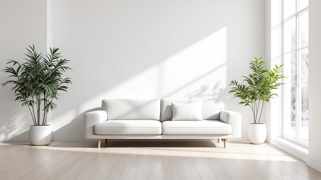
Why Choose Classic White?
White paint is a great tool for homeowners. It creates a simple backdrop that makes your furniture and art stand out. In a sunny Carmel home, a cool white can feel fresh. In a cozier room, a warmer white can create a welcoming glow.
Pro Tip: The "right" white depends on your home's lighting. Test paint samples on different walls and look at them during the day before you decide.
How to Implement Classic White
- Warm vs. Cool: For a friendly living room, try a warm white like Benjamin Moore's Cloud White. For a clean kitchen or bathroom, a cool, pure white like Sherwin-Williams' Pure White is a good pick.
- Add Dimension: A pure white room can feel boring without texture. Add warmth with wood floors, soft rugs, and fabrics. For more style, you can try different textured wall painting techniques.
- Create Contrast: Paint the trim, doors, or ceiling a different color, like a soft gray or even black. This can make the room look more high-end and interesting.
2. Warm Gray
Warm gray is a stylish neutral color that mixes cool and warm tones. It has the modern look of gray but with soft, earthy undertones so it doesn’t feel cold. As one of the best paint colors for homes, it creates a cozy and elegant feel.
Why Choose Warm Gray?
Warm gray, also called "greige," provides a soft backdrop that is both classic and trendy. Its warmth makes a space feel inviting. Its gray base keeps it looking clean and modern.
This makes it a great choice for open living areas or quiet bedrooms. It’s a popular option for professional interior painting in Monterey.
Pro Tip: Warm grays can have different undertones (green, beige, or violet). Always test a sample next to your trim and floors to make sure the colors match.
How to Implement Warm Gray
- Select a Proven Shade: For a safe and popular choice, try Benjamin Moore's Revere Pewter. Another good option is Sherwin-Williams' Accessible Beige, which creates a welcoming feel.
- Pair with Crisp Contrast: Use a clean white trim to make your warm gray walls stand out. This classic combo makes details like crown molding look sharp and finished.
- Incorporate Natural Textures: Add natural things like a wood desk, a jute rug, or linen curtains. This brings out the color’s warmth and makes the room feel complete.
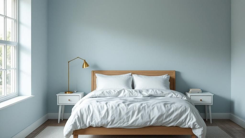
3. Soft Blue
Soft blue is a calming color that brings the feeling of the sky and water inside. As one of the best paint colors for homes, it’s a peaceful option that many people like. It looks great in a coastal Carmel home or a traditional house in Salinas.
Why Choose Soft Blue?
This relaxing color is known to help you rest, making it a great choice for bedrooms, bathrooms, and home offices. Soft blues with gray undertones look modern and stylish. Lighter blues can make a room feel bigger and more open.
Pro Tip: Soft blue looks amazing with natural textures. Try light wood furniture, jute rugs, and white linens to create a relaxed, beachy style.
How to Implement Soft Blue
- Warm it Up: Blue is a cool color, so balance it with warm touches. Brass lights, gold mirrors, and warm wood floors will keep the room from feeling cold.
- Create a Classic Look: For a style that never gets old, pair soft blue walls with clean white trim. This is a popular look in classic and coastal homes.
- Go Bold with an Accent: If you're not ready to paint a whole room, use a deeper blue on one wall. This adds depth and drama. To get more ideas, you can learn how to choose interior paint colors.
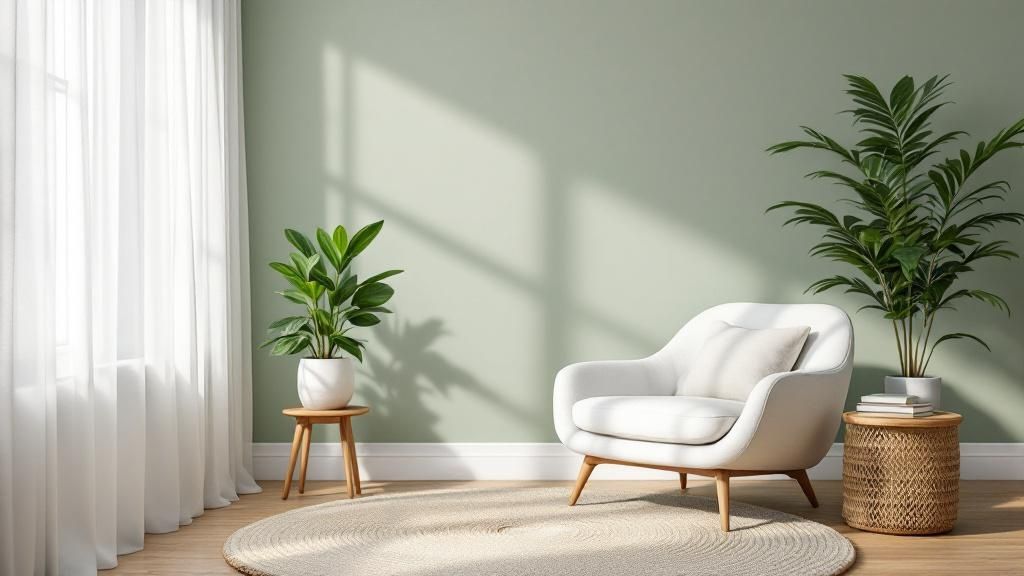
4. Sage Green
Sage green brings the calm feeling of nature inside. As one of the best paint colors for homes, this soft green connects your home to the outdoors without being too bright. It’s a flexible choice that works in many styles.
Why Choose Sage Green?
Sage green is a great choice for people who want a peaceful home. Its gray undertones give it a soft, modern look that feels both new and classic. This color helps you relax, so it’s perfect for bedrooms, bathrooms, and living rooms.
Pro Tip: Sage green looks very different depending on the light. A sunny room will bring out its yellow tones, while a darker room will make it look more gray.
How to Implement Sage Green
- Create a Natural Palette: Pair sage green walls with natural things like warm wood and creamy white trim. Adding real plants will make the room feel even more connected to nature.
- Use as a Sophisticated Neutral: In a kitchen, you can use a color like Benjamin Moore's October Mist on cabinets. It adds a gentle touch of color that still works as a neutral.
- Start with an Accent: If you are unsure, start with a sage green accent wall. This is a good way to try the color without painting the whole room.
5. Creamy Off-White
Creamy off-white is great for those who like white but want something softer. As one of the best paint colors for homes, it makes a room feel bright but also adds a cozy warmth. This color avoids the cold feeling that pure whites can sometimes have.
Why Choose Creamy Off-White?
A creamy off-white color is both bright and welcoming. It works as a nice background for both old and new decorations. Its warmth is especially good in rooms with less natural light.
Pro Tip: Creamy off-whites have different undertones like yellow, beige, or pink. Test samples next to your trim and furniture to make sure they match.
How to Implement Creamy Off-White
- Warmth and Welcome: Use a soft, warm off-white like Sherwin-Williams' Creamy in living rooms or bedrooms. This creates a relaxing and comfortable space.
- Layer with Textures: To make the room feel cozier, add different textures. Think about soft rugs, linen curtains, and natural wood furniture.
- Ensure a Flawless Finish: Warm, light colors can show bumps on walls. It is important to prepare the walls correctly. Knowing what paint primer is used for can help you get a smooth, perfect finish.
6. Soft Beige
Soft beige is a warm and friendly choice instead of a plain neutral. As one of the best paint colors for homes, it gives a room a cozy feeling that is always in style. It has more warmth than gray but is softer than brown.
Why Choose Soft Beige?
Beige is a classy neutral that can match many different styles. It creates a calm background that goes well with a lot of furniture. Its natural warmth can make a room feel more like a home.
Pro Tip: Beige undertones are very important. Test samples in your home’s light to see if they look too pink, yellow, or green.
How to Implement Soft Beige
- Complement with Trim: Use a clean white or soft cream trim to make the beige walls stand out. This classic mix looks neat and finished.
- Layer Textures: To keep a beige room from looking boring, add different textures. Try a soft rug, linen curtains, or pillows with patterns.
- Add Color: Use soft beige as a background for pops of color. It looks great with blues, greens, and even soft reds in your decorations or art.
7. Muted Terracotta
Muted terracotta is an earthy, warm color that makes a room feel grounded. As one of the best paint colors for homes, it looks like natural clay and connects your home to nature. This rich color is great for a home in Carmel with a Southwest style.
Why Choose Muted Terracotta?
This inviting color adds personality without being too much. It makes a space feel cozy and special. Because it is a soft color, it works well with neutrals, green plants, and natural textures.
Pro Tip: Muted terracotta looks different in different lighting. A bright room will show its warm, earthy side. A darker room will make it look deeper and cozier.
How to Implement Muted Terracotta
- Create an Accent: Use muted terracotta on one wall, like behind a bed or fireplace. This makes a statement without painting the whole room.
- Balance with Neutrals: Pair this color with creamy whites, beiges, or soft grays. This keeps the room feeling bright and modern.
- Embrace Natural Materials: Match the earthy color with things like wood furniture, stone, and woven fabrics. This creates a complete and layered look.
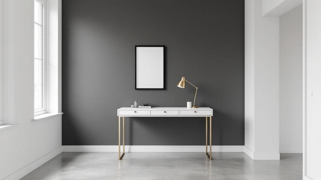
8. Charcoal Gray
Charcoal gray is a bold and stylish neutral that is a great option instead of black. As one of the best paint colors for homes, it adds depth without making a space too dark. This moody color is perfect for a statement wall or a whole room.
Why Choose Charcoal Gray?
Charcoal gray makes a room feel cozy and fancy. It is a great background that makes light-colored furniture and bright art stand out. It has a softer feel than black, which can be too dark.
Pro Tip: Charcoal colors can have blue or warm undertones. Test samples to see how they look in your home's light.
How to Implement Charcoal Gray
- Balance with Light: To keep a charcoal room from feeling dark, make sure there is a lot of light. Pair it with white trim, light floors, and bright fabrics.
- Create an Accent: A charcoal accent wall can have a big impact without a full commitment. It’s a great choice for a wall behind a bed or a fireplace. You can learn more about the best paint colors for selling a house to see how bold colors can work.
- Add Sophistication: Pair charcoal walls with metal accents like brass or gold. These shiny finishes add a touch of style and help reflect light.
9. Dusty Rose
Dusty rose is a soft, muted pink that adds warmth to a space without being too girly. As one of the best paint colors for homes, this grown-up pink is a popular choice instead of a regular neutral. It creates a soft, inviting feel.
Why Choose Dusty Rose?
Dusty rose is both trendy and classic. Its soft, earthy undertones make it easy to use. It creates a cozy and calm feeling, which is great for rooms where you want to relax.
Pro Tip: Dusty rose can look different depending on its undertones. Always test a big sample in your room to see how it looks with your light and furniture.
How to Implement Dusty Rose
- Subtle Accents: If you are not sure about painting a whole room, use dusty rose on an accent wall. It adds a pop of color without being too much.
- Elegant Pairings: This color looks beautiful with soft neutrals like cream, beige, and light gray. For a fancy touch, add metal accents like gold or brass.
- Balance with Neutrals: Popular shades like Benjamin Moore’s First Light are great for making a statement. Use clean white trim and neutral furniture to keep the room balanced.
10. Navy Blue
Navy blue is a classic and bold color that is a great alternative to other neutrals. As one of the best paint colors for homes, it has the depth of black but with a calmer feel. This rich color can make a dining room in Salinas look elegant.
Why Choose Navy Blue?
Navy blue is very flexible and makes other things stand out. It looks great with white, warm woods, and metals like brass or gold. In a bright room, navy shows its beautiful blue tones. In a cozy room, it creates a warm, snug feeling.
Pro Tip: Don't be afraid to use navy in small rooms. With bright trim and good light, it can make a small bathroom feel like a perfect little jewel box.
How to Implement Navy Blue
- Create Balance: To keep a room from feeling too dark, use navy walls with a lot of light-colored items. Think about white trim and cream-colored furniture.
- Use as an Accent: If a whole room seems like too much, use navy on one wall or on kitchen cabinets. This makes a strong statement without taking over the space.
- Warm it Up: Pair navy with warm metals like brass or gold in lights and handles. This adds a touch of style and keeps the blue from feeling cold. It can be hard to pick the right shade, but you can learn how to match paint color to your furniture.
Frequently Asked Questions (FAQs)
1. What paint colors make a room look bigger and brighter?
Light and neutral colors are best for making a room look bigger. Shades like classic white, creamy off-white, and soft beige reflect more light. This creates a feeling of open space.
2. What is the most popular paint color for a living room?
Warm grays, soft beiges, and classic whites are very popular for living rooms. These colors are neutral, so they match many furniture styles and create a welcoming feeling for your family and guests.
3. Should I use the same paint color throughout my entire house?
You don't have to, but it can create a nice, connected feeling. A good idea is to pick a main neutral color for common areas like hallways and then use different, matching colors in bedrooms or bathrooms.
4. How does lighting affect my paint color choice?
Lighting changes how a color looks. Natural daylight shows a color’s true shade. Warm, soft light bulbs can bring out yellow or red tones, while cool LED lights can make colors look more blue. Always test paint samples in the room you plan to paint.
5. How important is the paint finish (e.g., matte, satin)?
The paint finish is very important. A matte finish hides bumps on the wall but is harder to clean. A satin or semi-gloss finish is easy to clean and good for kitchens, bathrooms, and trim. Zillow reports that homes with satin or eggshell paint in living areas can sell for more.
Choosing the perfect paint colors for your home can completely change its look and feel. From the clean look of Classic White to the bold style of Navy Blue, each color has its own personality. A Warm Gray can make a Salinas living room feel cozy, while a Soft Blue can bring the calm beach feeling of Pacific Grove into your bedroom.
Ready to bring your vision to life? The expert painters at Legacy Painting & Renovating Inc. help homeowners across Monterey County, from Salinas to Carmel, choose and apply the perfect colors. Contact us today for a free estimate and see how we can transform your home.